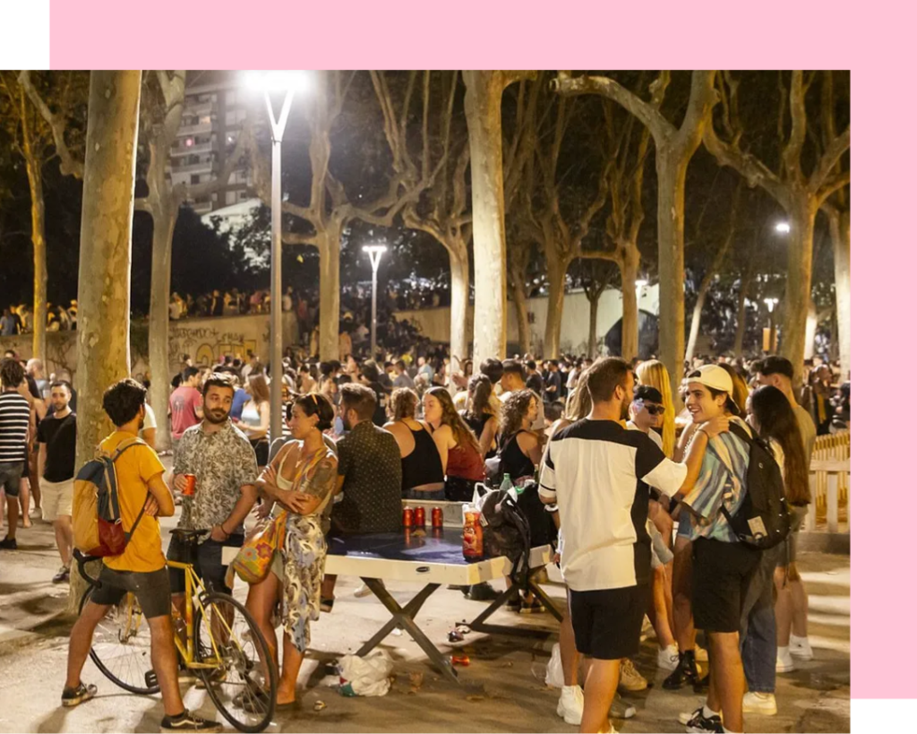
Many young people in Spain drink frequently every weekend without realizing the potential harm it can cause.
In addition to this, there are various external and internal factors that affect them, such as limited job opportunities and a high susceptibility to emotional and psychological issues.
A significant part of the problem begins with the normalization of drinking more than a glass or two in a day, turning it into a habit rather than recognizing it as a potential health issue.
For more details on this work, everything is documented in this link.
Solution
To find a solution, I have chosen the Design Sprint methodology.
How do we combat underage drinking with technological solutions? Subsequently, I made my sprint questions with the team and documented them on a digital board in Miro.
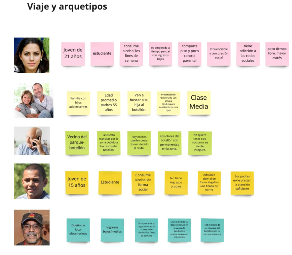
The next step would be to create our user personas, in order to step into their shoes and empathize with their needs better, thus designing something more in line with their interests
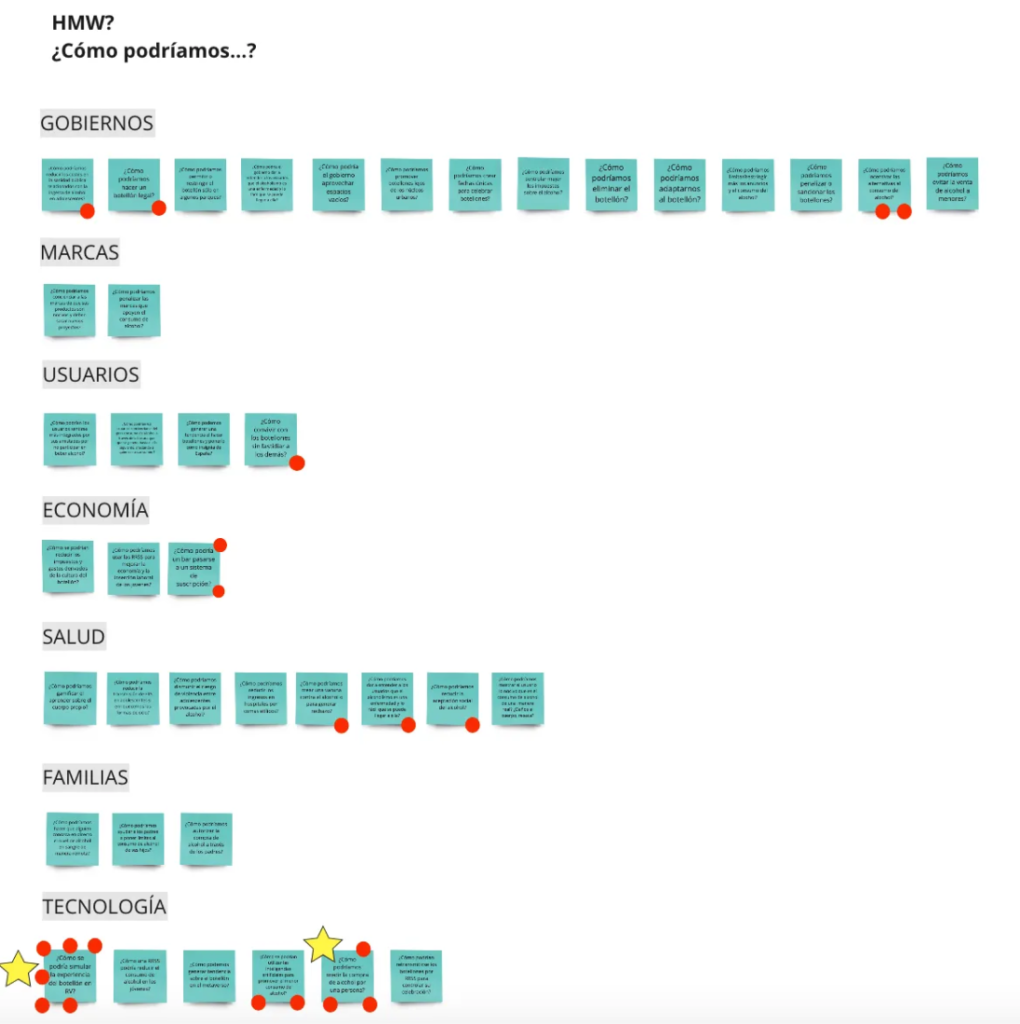
Now, we have to rephrase the initial questions using "How might we...?" to clarify the problem and define solutions, while consolidating similar ones. Then, we’ll use dotmocracy to vote on the questions to explore further. How might we simulate the experience of underage drinking in virtual reality?
We needed to get inspired through lightning demos or a wall where we can find inspiration to diverge and focus on a specific idea
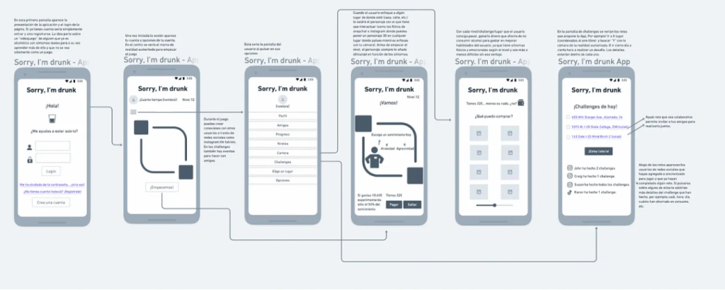
The upcoming stages involve creating the initial wireframes using the Crazy Eight method, followed by prototyping with the final screens, and concluding with testing to assess whether our final solution is effective.
From testing: It was seen as unreliable because users found it more useful to report to the police. The idea of “hacking” another device with just an app seemed too illegal and easy. It would be used more to locate gatherings to join for drinking than for reporting them.
Design System
I have used Outfit font because it’s readable, modern, and versatile. It offers clean, friendly design, works well across devices, and its easy to implement.
Outfit
Aa
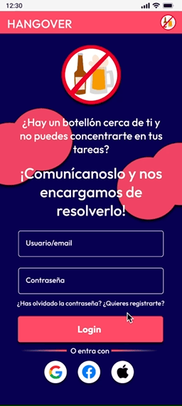
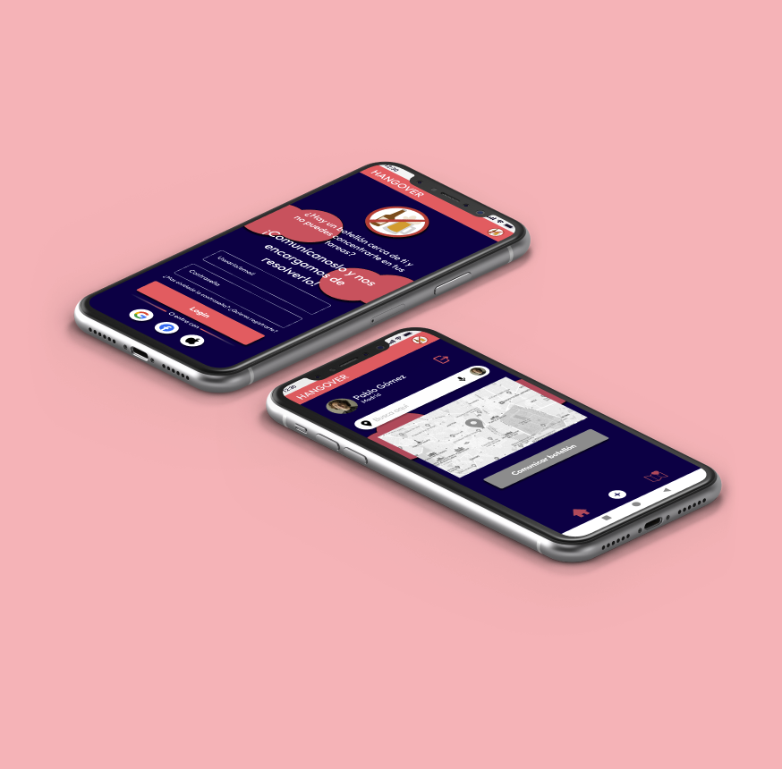
The chosen color palette for the app—#F45B69 (bright coral red), #07004D (deep navy blue), #C54963 (rich pinkish-red), and #FFFFFF (white)—creates a visually appealing and effective design. Overall, this combination balances urgency with professionalism, making it well-suited for an app focused on reporting disturbances with alcoholism in young people while keeping the interface engaging and user-friendly.
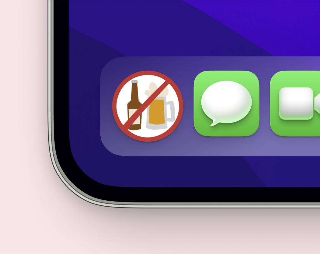
The logo features a beer bottle and a beer mug crossed out with a red prohibition symbol, clearly conveying a “no alcohol” message. Its purpose is to promote the reduction of alcoholism among young people by discouraging excessive drinking and raising awareness about its negative consequences. The simple yet effective design ensures immediate recognition and aligns with the app’s goal of addressing underage and binge drinking.
Conclusion
The app would not be viable at the moment. There needs to be prior awareness of gatherings as something more serious than just a current form of entertainment for young people in order to make progress in this area.
Users would be willing to use the app, but more as something fun and with a sense of humor rather than something serious. Perhaps if the government itself took measures, such as running awareness campaigns more frequently to emphasize the issue’s importance, people would be more involved in helping to solve this problem.
Despite these challenges, the app has the potential to be a valuable tool if implemented alongside broader awareness initiatives. If perceptions around gatherings shift towards recognizing their serious consequences, the app could serve as a complementary resource for prevention efforts. Additionally, refining its purpose—perhaps by focusing on promoting safe alternatives rather than solely reporting—could increase user engagement. With the right adjustments and support from public awareness campaigns, the app could play a positive role in addressing this issue.