This project is about conducting Nielsen’s heuristics on an e-commerce website. My choice is the Miniplanta website, as I have a deep passion for plants and find their online store particularly interesting.
For more details on this work, everything is documented in this link.
Research & Analysis
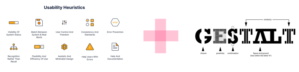
For this project, I will analyze an e-commerce website using Nielsen’s heuristics alongside the Gestalt principles. By combining these usability guidelines with visual perception laws, I aim to evaluate both the functionality and design of the site, ensuring an intuitive and user-friendly experience.
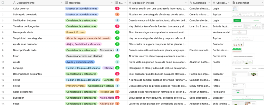
In addition to analyzing the heuristics on the website along with Gestalt principles, I have established several categories:
The type of element being analyzed.
An explanation of the error or positive findings I have encountered.
A severity rating system from 1 to 5 to understand how severely it affects usability and the user experience on the website.
The location of the analyzed element.
Suggestions on how to improve it.
Screenshots to provide a clearer visual reference for what is mentioned.
What sections have been analyzed?
Since this is a challenge to analyze the heuristics in general, I have done it for several pages such as the home, login, forms, footer, internal sections, etc.
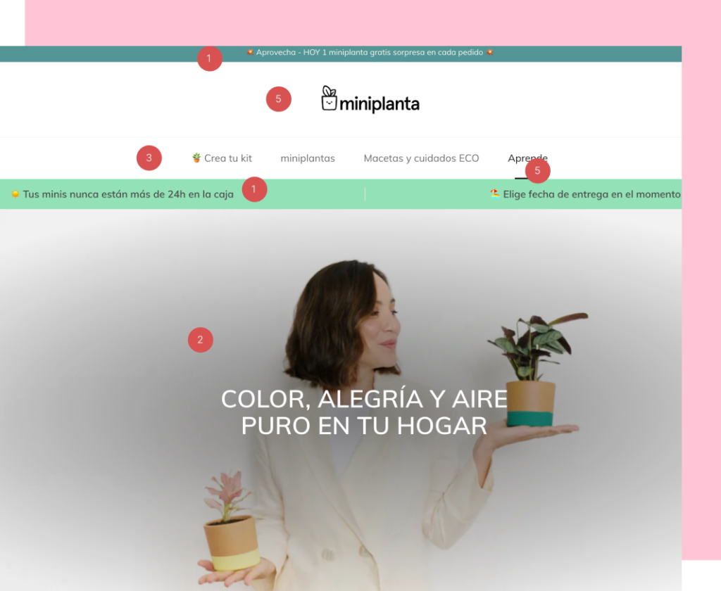
This is the first screen that appears to us in order to achieve a visual hierarchy through a severity rating from 1 to 5 for identifying the errors found:
The main areas for improvement include inconsistencies in font sizes, misalignment of icons and logos, improper image handling leading to pixelation, better distribution of irrelevant information, an attention-grabbing radial fill in the hero image, overlapping underlines during hover, and most importantly, a poorly planned information architecture.
For a more detailed and in-depth analysis in this exercise, I’ve used the Airtable tool, as it provides better organization and clarity for quick understanding. You can take a look at it in the following Airtable link.
Conclusions
In conclusion, I believe that enhancing user experience design is essential, as continuous iteration is necessary to ensure smooth and intuitive usability. A poorly designed interface can lead to frustration, confusion, and even abandonment of a product or service. For example, if navigation is unclear, users may struggle to find what they need, leading to a negative perception of the brand. Similarly, an overly complicated checkout process in an e-commerce site can result in lost sales.
By constantly refining and improving the design based on user feedback, we can create experiences that are not only functional but also enjoyable. After all, we all know that a seamless user experience is key to success.